The Org Redesign: A New Home for Organizations on Artsume
A ground-up rebuild of the organization side of Artsume — a unified dashboard, a redesigned opportunity builder, a faster applications workspace, a smarter artist network, and a settings experience that finally feels at home.

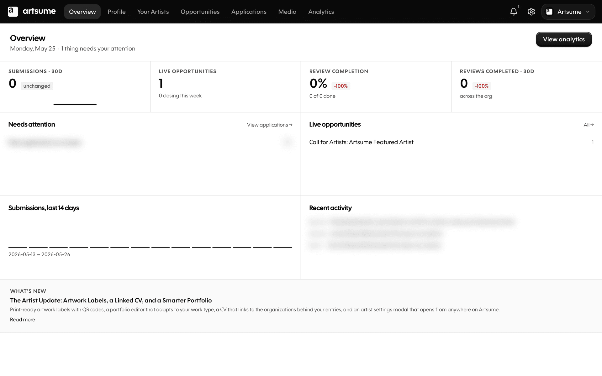
- A unified organization dashboard with a new top bar and tab strip
- Settings now opens as a modal from anywhere, on every screen
- Opportunity builder with optional sections you can add and remove
- Applications workspace with a persistent queue rail and mobile review sheet
- Three-mode scoring — recommendations, sliding scale, or full rubric
- Affiliated Artists (formerly Network) with bulk Verify, Dispute, and Dismiss
- Editable organization profile with About, Contact, Card, and Related Orgs
- Featured Artist lanyard carousel on the homepage
- Right-side mobile drawer for cross-section navigation
The Org Redesign
For the past few months, we've been rebuilding the organization side of Artsume from the ground up. Not a coat of paint — a real rethink of how organizations move through their day on Artsume: posting opportunities, reading applications, scoring them, finding affiliated artists, and running the team.
This release brings everything together. It's the biggest update we've shipped since the platform launched.
Here's what's new.
A new home for your organization
The old organization dashboard was a stack of separate pages glued together with a sidebar. The new one is one continuous surface with a top bar and a tab strip that takes you everywhere.
- The top bar holds your platform mark, your tab strip, and the right-side cluster — search, notifications, your admin menu, and an organization switcher when you're in more than one.
- The tab strip is seven tabs: Overview, Profile, Affiliated Artists, Opportunities, Applications, Media, and Analytics. It remembers where you were and gets you back without a refresh.
- On mobile, a right-side drawer handles the same cross-section navigation.
Inside each tab, the layout is matched to the work: a full-width canvas for the Overview, a two-column list with a picker rail for Applications, and a three-column workspace when you open an individual application. Same visual rhythm everywhere, but the shape of the screen fits what you're doing.
Settings, now a modal
Settings used to be a separate set of pages at /settings/.... You'd click a link, lose your current view, and have to find your way back when you were done. Not anymore.
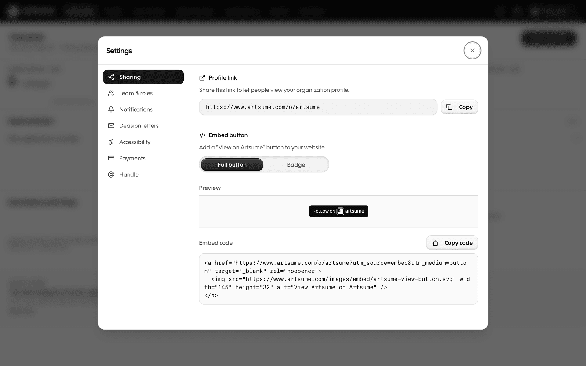
Settings now opens as a modal — over your current screen, with a left rail of sections on desktop and a drill-down list on mobile. Close it, and you're right back where you were.
Every settings link across Artsume opens this modal in place. The Admin menu, the mobile nav, links in dialogs, even old ?openSettings= URLs from emails. There's no /settings page to bookmark anymore — the modal is the experience.
What's inside:
- For organizations: Sharing, Team & roles, Notifications, Decision letters, Accessibility, Payments, and Handle.
- For artists: Profile, Handle, Account, Notifications, Scout, Accessibility, and Payments.
Each section loads on demand, so opening the modal feels instant even when you have a long settings list.
A new opportunity builder
The opportunity builder got a major rework on top of the one we shipped in March.
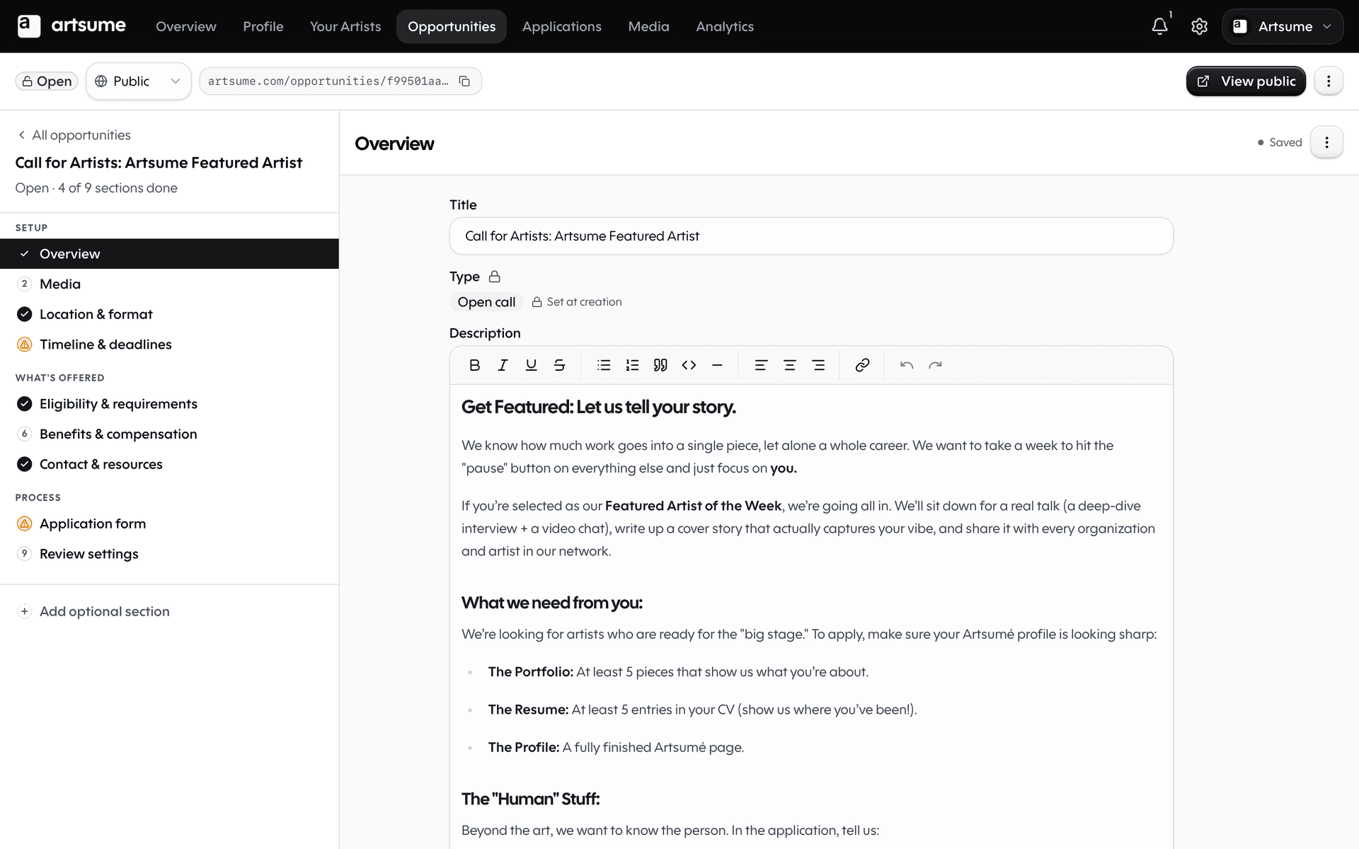
Optional sections you can add and remove
Not every opportunity needs every section. A simple grant doesn't need a Selection Process page. A residency might not need a Legal Contract upfront.
Now you decide. Every section has an Add button when it's hidden and a Remove affordance when it's shown. The section rail only shows what you've enabled. Hidden sections never appear in the form, never show as incomplete, and never block you from publishing.
Decisions, Legal, Selection Process, and a handful of others are now optional out of the box. You can turn them on if you need them and leave them off if you don't.
A right-side Configure rail
Configuring the application form used to mean opening a heavy drawer that covered half your screen. Now the Configure action on Portfolio, Statement, CV Import, and Contact Fields opens a slim rail on the right — your form stays visible while you set things up.
The rail dispatches to the right editor automatically based on what you're configuring, so you never lose context.
Per-form autosave
There's no global Save button. There's no global Save context. Every form saves on its own schedule.
- Type into Benefits — only Benefits saves.
- Edit Eligibility — only Eligibility saves.
- A network error in one section doesn't block the others.
Each form's section indicator updates the moment its save lands. The rail no longer guesses — it shows exactly what's filled in based on what's actually in your form.
Sticky top bar with publish controls
A sticky top bar sits above every section with your title, status, an autosave indicator, and the Publish controls. Pre-flight summary, status changes, and the manual save button are all up there. Always one click away.
Applications, rebuilt
The applications side of organization work — reading, scoring, deciding — got the biggest rebuild in this release.
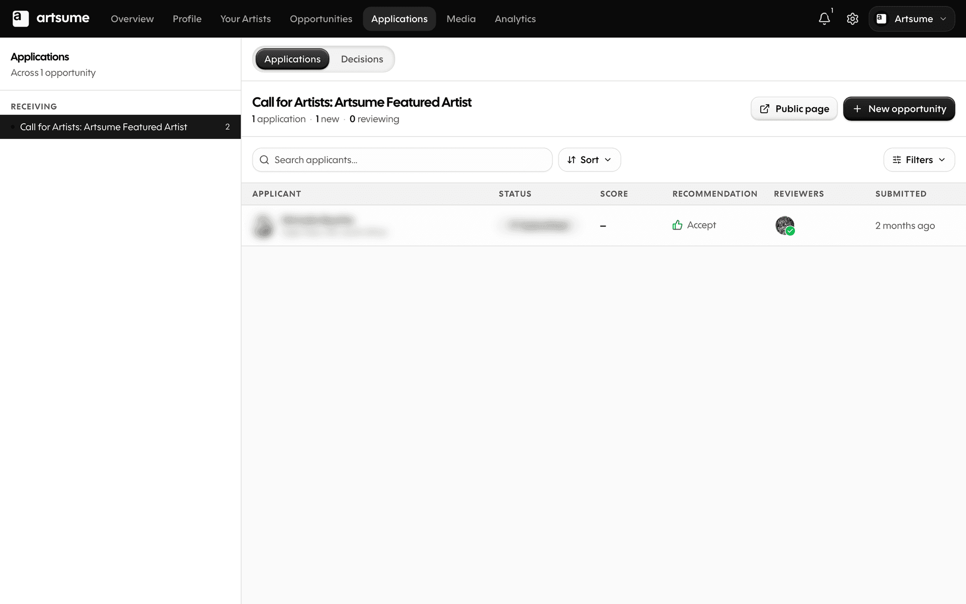
The Applications list
The Applications page is a two-column layout: an opportunity picker on the left and a full applications table on the right. Filters live in a drawer instead of a sidebar that ate half the screen. Sort by score, status, submission date, or applicant — all from chips that show your current sort at a glance.
The list query is rebuilt for speed. Application counts on the opportunities listing now come from a materialized column, so opening the page is instant even with thousands of applications.
The Applications workspace
Open any application and you land in the new workspace — a three-column layout:
- The queue rail on the left. Every application for this opportunity, in your current sort order. Click any one to jump to it without losing your place.
- The applicant in the middle. Their answers, portfolio, CV, statement, and contact card, all on one continuous canvas.
- The review panel on the right. Scoring controls, recommendation chips, notes, and the activity timeline.
The queue rail persists across applicant navigation. Click Next, score the application, click Next again — the rail stays put and your filters stay applied.
Mobile review, on its own terms
On mobile, the workspace takes over the screen. The top bar hides, a workspace-local header takes its place, and reviewing happens through two purpose-built sheets:
- Queue sheet for jumping between applicants
- Score peek sheet for the review controls — slides up from the bottom, scores in, dismisses
No more pinch-zooming a desktop layout on a 6-inch screen.
Three-mode scoring
Scoring isn't one thing. Different opportunities want different rigor. We now support three modes:
- Recommendation — quick icon chips for "Yes / Maybe / No"
- Sliding scale — a single overall score
- Rubric — your full scoring rubric with weighted criteria
The picker chooses the mode based on how the opportunity was configured. Switching modes between opportunities is seamless.
Affiliated Artists
The old "Network" tab is now Affiliated Artists, and it's been merged with what used to be a separate CRM page. Everything you need to manage the people connected to your organization — contacts, applicants, CV claims, mentions, follows, groups — lives on one unified surface.
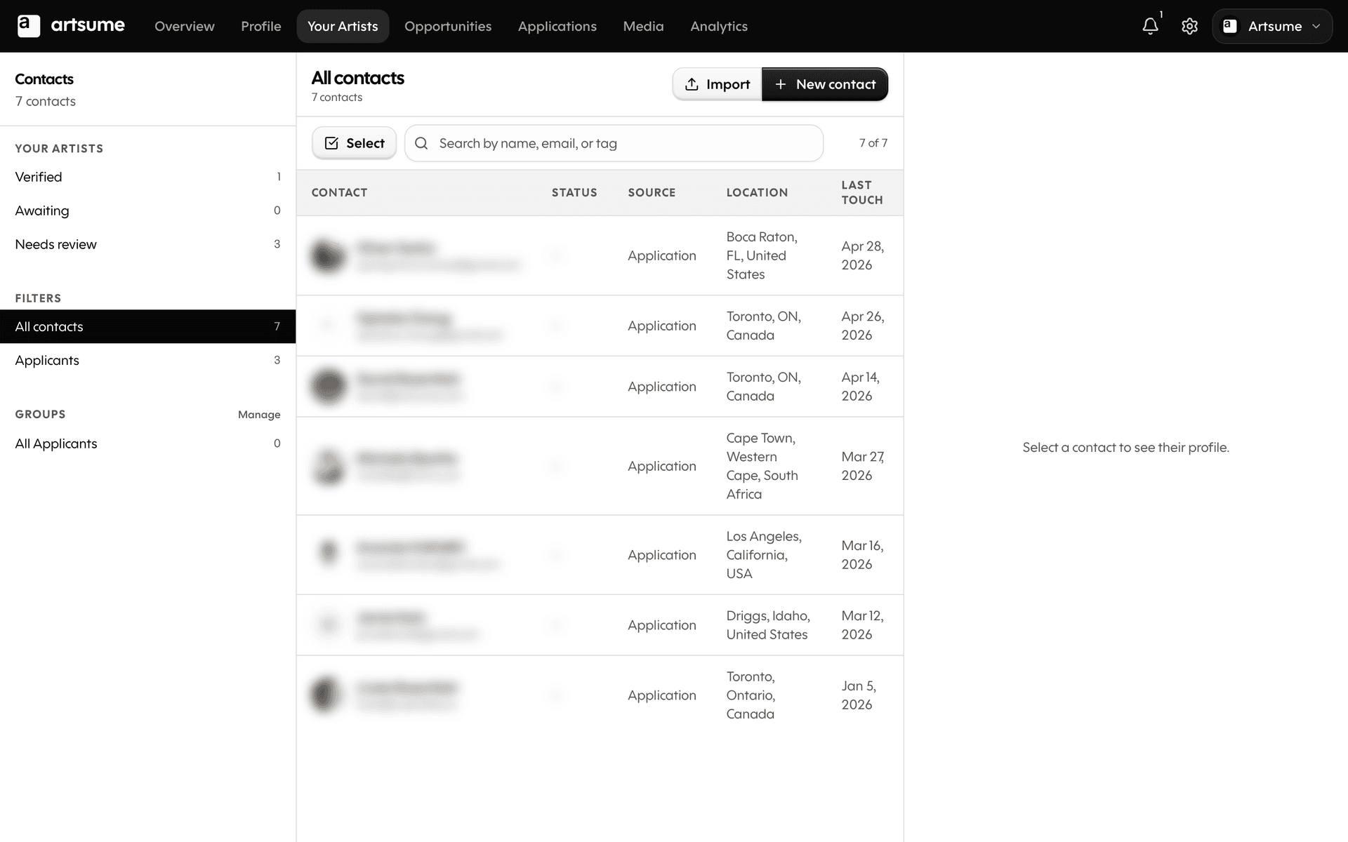
One page for contacts and claims
On the left rail you'll find your claim buckets at the top — Verified, Awaiting, Needs review — and your filter views below them: All contacts, Applicants, and any saved smart filters. Groups have their own section below that.
The contacts table on the right is the same in every view, just filtered differently. Search by name, email, or tag. Import contacts or create one from scratch. Open any row to see their full profile in the right rail.
Verify, Dispute, Dismiss in bulk
Verifying CV claims one at a time is slow. So we made it multi-select.
- Tap Select above the table to enter multi-select mode
- Tick the checkboxes for the rows you want to act on
- A Bulk Actions bar appears at the bottom of the screen
- Verify, dispute, or dismiss them in a single action
The page refreshes once when you're done — no stutter between rows updating.
A lifecycle, not a list
Every association now has a state — Verified, Disputed, Dismissed, or Awaiting. The page makes it obvious which artists still need your attention. Status badges replace the old inline action column, and actions live in the right rail where they belong.
Smart filters, groups, and email blasts
The CRM features that lived on a separate page are now built into Affiliated Artists:
- Smart filters — build segments by activity, by location, by claim status, and save them as views
- Groups — create groups, add contacts inline from any profile, edit smart-filter definitions in place
- CSV export — pull your contacts out anytime
- Inline email blast — composing an email is a bulk action on the contacts list, not a separate page
The standalone email-blast page is gone. To email a set of contacts: select them, open the action bar, write the email. Three clicks instead of seven.
Editing your organization profile
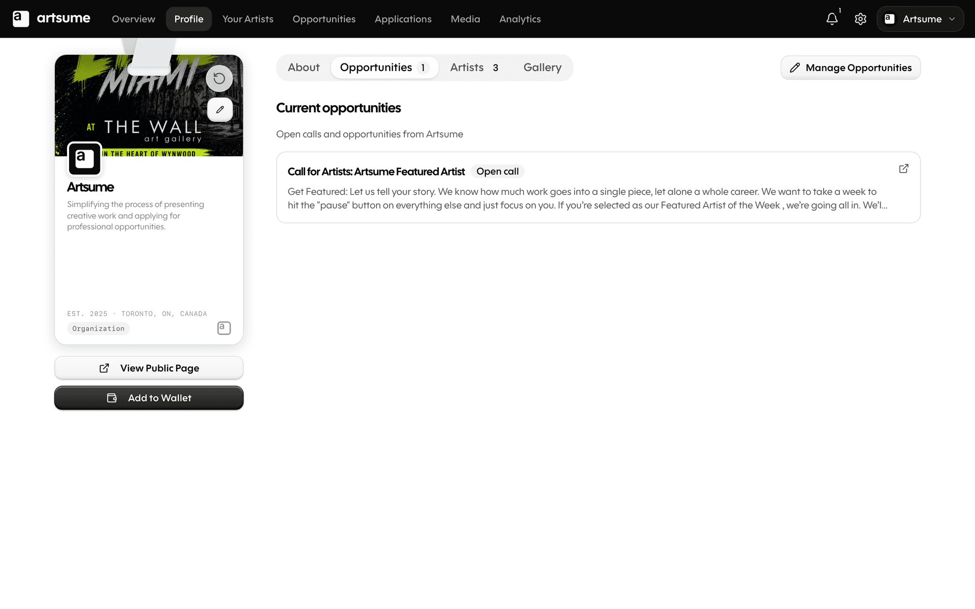
We split how organizations manage themselves into two surfaces:
- The Profile tab — your editable organization profile. The About panel, the Card, the Contact info, and Related Orgs all live here. Each one opens a focused dialog when you edit it.
- The Settings modal — the operational stuff: notifications, payments, decision letters, accessibility, handle.
The old single, sprawling organization settings form is gone. In its place: four small dialogs, each scoped to one job, all opening from your Profile tab instead of a settings menu buried five clicks deep.
The contact card
The contact card — the slim card that summarizes how someone can reach you — got a redesign across every place it appears.
- On the apply form — clearer identity row, a receive-checklist showing what the organization will see when you submit.
- On the review screen — every field is clickable. Email opens your mail client, phone dials, website opens, social goes to the profile, public profile link goes to the artist's page.
- In the wallet pass — derived from the same source of truth, so what you see in Artsume is what shows up on the pass.
Phone is no longer in the wallet pass (privacy improvement). Everything else lines up across surfaces.
Mobile navigation
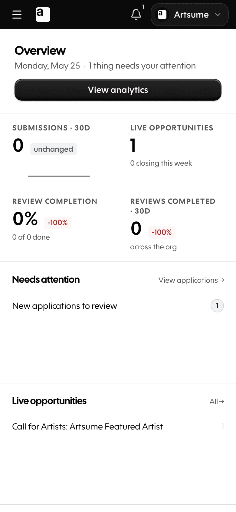
The mobile experience got rebuilt around a right-side drawer for cross-section navigation. The mobile top nav is now just a bell and a hamburger. The drawer holds your tabs, your admin menu, and your settings trigger.
The organization dashboard's mobile tab bar swapped its 5th slot (Settings) for More, which opens the drawer. Settings still works — it just opens the modal from the drawer like everywhere else.
Featured Artists, front and center
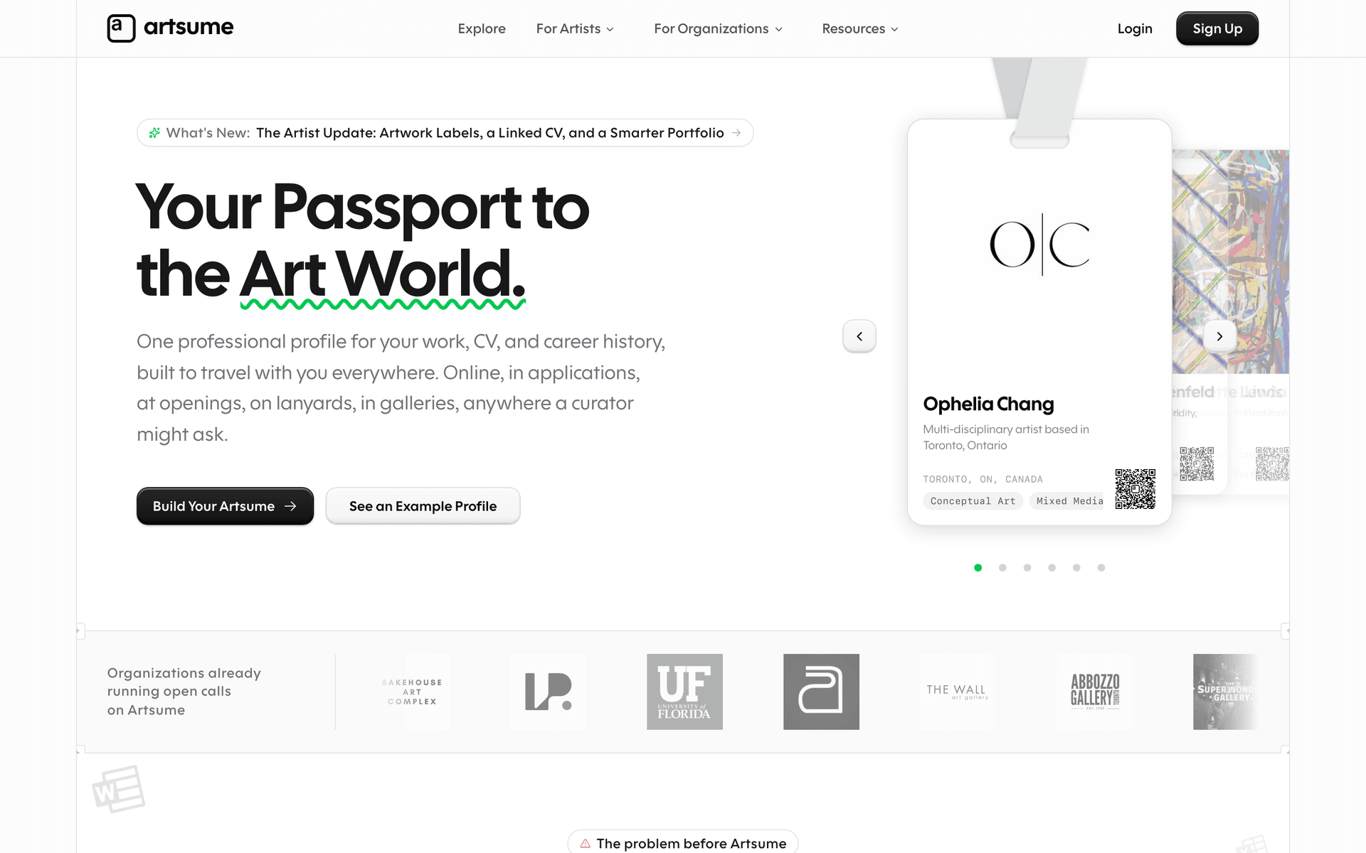
The homepage hero now includes a lanyard carousel featuring artists we want to spotlight. Asymmetric grid, lanyards swinging, real artists from the community.
We also built an admin curation page for organizing featured artist placement (homepage hero vs. general feature). When an artist gets featured, their profile lights up with a badge and they get a notification.
Performance and polish
Across the redesign, we tackled the slowest, jankiest parts of the organization experience:
- Application counts on the opportunities listing are now materialized — no more multi-second loads on orgs with thousands of applications.
- The applications list query was rewritten with proper filter, sort, and search support.
- Settings sections load on demand, so opening the modal doesn't pull in every section at once.
- Per-form autosave debounces independently, so a slow save in one section doesn't block another.
We also did a sweep across every dialog in the app:
- Sentence case everywhere (no more "Edit Your Organization Settings" — just "Edit your organization settings")
- Consistent card strip + sticky footer pattern on settings forms
- Better skeleton states for every list and detail view
- Cleaner empty states across notifications, applications, and affiliated artists
What stays the same
- Your data. Every opportunity, application, review, CV, portfolio, and contact stays exactly where it was. Nothing migrated, nothing lost.
- Your URLs. Old settings URLs redirect to the modal automatically. Old organization handles still work. Old links in emails still land where they should.
- The artist side. Artists don't see most of this. The redesign is on the organization side; artists keep the same dashboard, the same apply flow, the same portfolio, the same CV.
What's next
This release closes out the organization redesign as a body of work, but a few pieces are still moving:
- The design language refresh — softer floating surfaces — is in flight on a parallel track. You'll start seeing it land on individual surfaces over the coming weeks.
- Telemetry events for the settings modal, the new builder, and the workspace are being added so we can see exactly which sections people use most.
- The Media tab is your new home for organization uploads — and we're still rolling out the full media library experience inside it.
If you run an organization on Artsume, the next time you log in will feel different. If anything feels off, email us at support@artsume.com. We read every message.
Thanks for using Artsume.
Topics
Related Updates
The Artist Update: Artwork Labels, a Linked CV, and a Smarter Portfolio
Print-ready artwork labels with QR codes, a portfolio editor that adapts to your work type, a CV that links to the organizations behind your entries, and an artist settings modal that opens from anywhere on Artsume.
A Cleaner Contact Surface, Top to Bottom
A new quick-fill contact card on the apply form, clickable contact details in the review workspace, and a handful of bug fixes for older applications.
The Unified Applications Hub: Track Every Application in One Place
Manage every opportunity you're applying to (on Artsume or anywhere else on the web) from a single dashboard. New grid and pipeline views, a redesigned workspace for drafting applications, and portfolio + CV exports tailored to each submission.